Thursday, December 18, 2014

Final Extra Credit

 A man was harassing people at the subway station , and when Ki Suk Han tried to peacefully stop him, the man pushed Han into the path of where the subway was arriving. Photographer Umar Abassi said he tried to help Han , but when he realized he couldn't he starting taking pictures hoping that the flash would warn the driver. 

Umar Abassi said he took the photo so that the flash going off would alert the driver.
I think it was good idea that Abassi took the photo for many reasons.
Although Umar tried to help Han, I think he could have tried to help more. He could have helped Han more or gotten other people to help him as well. 

I agree that the photo should be on the front page of the newspaper. I agree , because it alerts people of what really happened and they can actually see how it happened through the picture. 

To a photo journalist capturing what is happening in life is more important than trying to stop things from happening. I think this , because that is how photo journalist make a living and maybe if they stop something from happening they ruined their chance of having their picture on a front page. 

I think it is acceptable because they were the ones who photographed that thing so it is their right to involve their selves.
I think that a photo journalist should influence events as they happen , because just them photographing the event is influencing it. 

The most appropriate thing for a photographer at this point in time would be to photograph the event. Some people might not agree with this , but this is how some people make a living. 

Wednesday, December 10, 2014

Final Review

Mr. Smith has found his monkey on the streets of Paris, France this morning around 10:00 am, they are preparing to move to the United States. Mr.Smith looked for his monkey for the past week and was stressing because they were planning on moving to the United States. 


A group of people are running a race today in Guatemala to raise money for a local charity. These people were about to finish the race for the local charity.


  1. Rule of Thirds- when the subject of a picture is in line with the lines on the view finder
  2. Balancing Elements- making sure that the picture is balanced and has equal parts to it
  3. Leading Lines- The lines in the picture are somehow leading to the main subject or making it stand out more
  4. Symmetry & Patterns- break the patterns in some way to make the main subject pop out more
  5. Viewpoint- The angle in which you will take the picture from to make it more interesting
  6. Background- having a simple yet interesting background to make the main subject more evident
  7. Create Depth-add more "layers" from the background such as hills, and mountains etc.
  8. Framing-placing natural frames such as trees and holes etc. to create a frame for the picture
  9. Cropping- making sure that nothing else in the picture is in the way of the main subject and "cropping" things that are in the viewfinder
  10. Mergers and avoiding them- use plain backgrounds and objects that won't interfere with the main subject


Friday, November 21, 2014

body evolution

first video
-made her neck longer
-made her face slimmer
-made her eyebrows bigger
-her eyes were made bigger

second video
-made her nose smaller
-made her lips darker
-made eyes bigger
-made her neck longer
-made her legs thinner to make her butt look bigger
-made her skin lighter
-made her stomach thinner
-made her legs longer
-made her feet smaller
-made her hair lighter

third video
-they made her legs thinner
-made her butt smaller
-made her arms thinner
-made her torso thinner
-made her boobs bigger
-made her legs a lot thinner to make her butt look bigger
-made her waist thinner 
-made her legs longer
-made her head smaller
-made her hair longer
-made her hair darker
-made her hair fuller

4. I do not think it is ethically acceptable to change a person's appearance in photoshop. This is wrong, because by doing this in photoshop you are basically telling that person that they do not look good enough. 

5. There are no circumstances in which changing a person's appearance is okay.

6. I think it is okay if you put a filter on a picture or even if you put make up on in photoshop, but I think that completely changing the original picture or changing what the person actually lookd like is wrong.

7. In fashion photography it is more common to use photoshop to change a person, but in photo journalism photoshop is mostly used to change the colors and levels of a picture. 

8. Each picture relates to reality in one way or another even if they completely photoshopped the picture.

9. We watched these videos to get a better understanding of photoshop and what people actually use it for.

10. None of the videos are about guys because they don't many things to photoshop and girls usually photoshop themselves to make them selves look better. 

Wednesday, November 19, 2014

Magazines part 2

Early Magazine Covers-
The main attribute for Early Magazine Covers was trying to model their covers similar to books at that time. On the cover the only information it had was the title of the magazine and the publication information. Magazines also had table of contents cover. There ere many generic covers in this time period. Besides the plain generic covers some magazines didn't  have covers, such as newspapers.

The Poster Cover-
Most magazine covers during the time period of 1890's to 1960's were poster covers. Poster covers were used so often that it seemed to be the only magazine cover that existed. Charles Dana Gibson and Maxfield Parrish were very famous in the 1900's. They were very famous because many of their art work appeared on poster covers of magazines. 

Pictures Married to Type-
The main attribute of Pictures Married to Type was to draw in readers by their cover lines. Most magazines just had art work and pictures on the covers. Pictures Married to Type magazines had pictures and art work ,but besides that they had cover lines. These were the first famous magazines to have cover lines. 

In the forest of Words-
The main attribute for In the forest of Words was to draw in readers attention by adding descriptions on the cover. In the forest of Words were the first famous magazines to have descriptions of what was in the magazine, on the cover. Nowadays a picture for the cover is not enough to catch someones attention. That is why magazines now have big titles, cover lines, and a description on the cover.


Favorite

Finalist
Harper's Bazaar, May, Summer Fashion Issue
"The May issue unveiled not only summer’s essentials but also our cover star Gwyneth Paltrow, in a breathtaking Dior couture headpiece. Shot by Daniel Jackson, the image paid homage to a Richard Avedon photograph that appeared in BAZAAR’s April 1965 issue—revealing that in fashion, history is worth reliving."
- See more at: http://www.magazine.org/asme/magazine-cover-contest/past-winners-finalists/2014-winners-finalists#sthash.9j9i9qeW.dpuf

critique:
I chose the Bazaar Magazine as my favorite cover. I really liked the cover of Bazaar Magazine. I really like the cover of the magazine because the exposure was really bright but not to bright were you can not see the main subject. They photographer followed a couple rules of photography. These rules were simplicity, because the background was simple and grey and it made the main subject stand out even more. Another rule that the photographer followed was framing. There was not excess space on the cover. The photographer nicely framed the models face on the cover without cropping part of her face out. Another thing that I liked about the cover is how the title of the magazine stood out. The title stood out but it was not in a crazy font of color to distract from the main subject. 

best covers

1.  informal
2.  formal
3.  enviriental
4.  informal
5.  formal
6.  informal
7.  formal
8.  formal
9.  formal
10. formal
11. formal
12. informal
13. formal
14. formal
15. formal
16. formal
17. informal


Magazine Tips

1. Familiar to recognize

2. Make the cover emotionally appealing

3. Build curiosity so that the people can pick the magazine up and read it

4. Make it intellectually stimulating and interesting

5. Make it fast and easy to scan over

prompt shoot


Cold
 Purple
 Electric


Monday, November 10, 2014

American Soldier

The most powerful picture is the one where the dad is holding up the sign that sat "welcome home Ian" This is the most powerful picture because it shows his dad which was the most important person the Ian left behind.
set 1:  image #1- #9
set 2:  image #10- #30
set 3:  image #51- #75
set 4:  image #76 - #82

The last set of pictures was the most powerful. They were the most powerful because he came home from Iraq and got married to Devin. 

All the images work together to tell a story because they are all in order and all the emotions in the picture tell what is going on in the picture. 

For the photos were Ian is the main subject, they are usually in present tense. 

The captions enhance the pictures because they tell what is going on and the emotions in the picture. 

picture #2- Ian is reading his diploma and transcripts from his high school. He has just graduated from Bowie High School and he has planned to join the army. 

picture #5- Ian sadly sits with his father on the couch. They were talking about Ian and his future in the Army.

picture #9- Ian stands in a room with other men that are wanting to join the army. Ian was reciting the Army Oath while his mom and other people watch him from the back. 


Friday, October 31, 2014

Rules of Photography Part 2

1. Rule of Thirds
2. Balancing Elements 
3. Leading Lines 
4. Symmetry and patterns 
5. Viewpoint 
6. Background 
7. Create Depth 
8. Framing
9. Cropping 
10. Avoiding Mergers 

self portrait part 1

1. Break the Rules of Composition

There are a lot of ‘rules’ out there when it comes to composition and I’ve always had a love hate relationship with them. My theory is that while they are useful to know and employ that they are also useful to know so you can purposely break them – as this can lead to eye catching results.
The Rule of Thirds is one that can be effective to break – placing your subject either dead centre can sometimes create a powerful image – or even creative placement with your subject right on the edge of a shot can sometimes create interesting images.

2. Introduce a Prop

Add a prop of some kind into your shots and you create another point of interest that can enhance your shot.
Yes you might run the risk of taking too much focus away from your main subject but you could also really add a sense of story and place to the image that takes it in a new direction and gives the person you’re photographing an extra layer of depth that they wouldn’t have had without the prop.

3. Hold Your Camera on an Angle

Horizontal and Vertical framings are not the only options when it comes to shooting portraits. While getting your images straight can be important in when shooting in these formats holding your camera on a more diagonal angle can also inject a little fun into your images.

This type of framing can add a sense of fun and energy into your shots. Just don’t ‘slightly’ do it or you’ll have people asking themselves if you might have mistakenly held your camera crooked.
Environmental Portrait
 I chose this picture for "Environmental Portrait" because it is at a beach and it had a romantic feeling.
I chose this picture for "Environmental Portrait' because it is also at a beach and this photo does not looked posed. 
Photography Self Portrait 

 I liked this picture because of how interesting it is being black and white but some parts are in color.
I chose this picture for self portrait because of how odd but good it was. You don't typically see pictures like this and that is why I liked it.

Casual Portrait
 I chose this picture because I love Marylin Monroe and I also like the simplicity of this picture.
I also like this picture because of the background. You can tell she is outdoors but the background is not in focus which makes the lady stand out. 

I will take pictures of my little sister most likely. I will shoot outside around our neighborhood because we have a lot of open space. To make the pictures successful I will shoot from different angles and make sure to follow the rules of photography. 

Monday, October 27, 2014

Aperture, Shutter Speed and ISO

Aperture
F2.8
F16
1. Our eyes relate to aperture.
2. The smaller the Aperture the larger the f-stop, the higher the Aperture the smaller the f-stop
3. Aperture impacts the Depth of Field because it brings all foreground and background objects to focus.

Shutter Speed

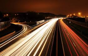
High shutter speed
slow shutter speed
a. High shutter speeds
b. High shutter speeds
c.High shutter speeds
d.High shutter speeds
e.High shutter speeds
f. High shutter speeds

a. slow shutter speed
b.slow shutter speed
c.slow shutter speed
d.slow shutter speed
e.slow shutter speed
f.slow shutter speed

2. Auto- both high and slow shutter speeds are automatically selected
    Aperture Priority- you can set the lens aperture but the camera select the shutter speed
    Manual- you se;ext both the aperture and the shutter speed

ISO
ISO 200

ISO 3200
1. It is better to shoot at a higher ISO at a sporting event because it takes the picture quicker. 
2. It is better to use low ISO when there is enough light. 
3. It is better to use higher ISO when there is not enough light, and inside without a flash. 

1. 2.8, 4, 5.6, 8, 11, 16, 22
2. 1 sec, 1/60 sec, 1/4000 sec
3. 100, 200, 400, 800, 1600, 3200, 6400, 12800, 25600

Wednesday, October 22, 2014

Love and Loss

1. Looking at these pictures made me feel vey sad but also very touched. The pictures are sad but they captured the wife and her process while she was sick.

2. I think the photographer meant that the pictures do not define you but they define that moment like a memory. He also could have meant that the pictures just capture a little part of your life.

3. I think I would try to take pictures like this if I was in a similar situation.

4. If I could write Angelo a letter I would say that I am sorry for his loss but on a good note the pictures were amazing and he really captured what they were going through and these pictures could have really helped someone if they are going through a similar thing.

Abandoned Theme Parks

1. Out of any of the abandoned theme parks from the two websites, I would like to visit is Nara Dreamand in Nara, Japan. I would like to visit, because it reminds me a lot of Disneyland and Disneyland is my favorite amusement park. I also think it would be very intersting to see because in the pictures Nara Dreamland looks very happy and colorful but it is abandoned.


3. Five unusual places: A underwater sculpture park, an underwater post office, ice caves, Mica Mine, and Lake Hiller. 

4. No one in particlar has been documenting the Grenada Underwater Sculpture Park, but Jason de Claires Taylor is a English sculptor making the statues. This is a picture of one of the sculptures. 
5. I think it woul be really neat to document this place so people can see the progress and how it is coming together. This place is very interesting to to me beacause I have never heard of anything like this and I really enjoy learning about things that are underwater. It would be really cool to see this underwater sculpture park come together and to study it over a long period of time. 

6. To go to this place and take pictures you would need a lot of money and materials. You would obviously need a waterproof camera or a waterproof case depending on which camera you are using. You would also have to be given permission by the owner and sculptor and other people. This would cost a lot of money depending on where you live and where you are traveling from. You have to figure out a way how you would get to this location since it is underwater.

Tuesday, October 21, 2014

Africa


1. I really enjoyed this article of Nick Brandt. His pictures were really good and interesting because they real capture the animal and its natural habitat. This article with Nick Brandt made me think more about animals, how people treat them, and how close many animals are to extinction. I think it was very important to read this article to see this information from a different persons perspective.
2.
3. I like this picture that Nick Brandt has taken of the giraffes. I enjoy this picture because it shows the giraffes and how they interact with each other in their natural habitat. 

4. I think framing is a rule of photography that Nick Brandt achieved in this picture. He kept the subject evident without having to crop anything out. 

5. Nick Brandt uses a Pentax 6711 to take pictures of the animals. This is important to know because he captures the image without having to zoom in. 

6. Brandt's purpose for taking these pictures was to capture them and their beauty before they were extinct or close to extinction. 

7. By taking these photos, Brandt hopes to catch people's attention and reduce the extinction of these animals. 

8. "There is something profoundly iconic, mythological even, about the animals of East and southern Africa" - Nick Brandt 


Friday, October 17, 2014

Funny Captions


In this photo a elderly lady is going through a Wendy's drive through not in a car, but a wheel chair. Gertrude the lady in this picture was really hungry but was tired of eating healthy food so she decided to treat her self to plastic and processed fast food.
This old man is very happily celebrating his 99th birthday. He is so excited to live one more year till he is 100 years old. Billy was happy until his cake caught on fire because his wife missed the candle and accidentally lit the cake instead. 
This man is very happy because he just did the last thing on his bucket list. Billy Bob Jim Joe has always wanted to get all of his body tattooed so he did it and now he can die happily knowing that he did the last thing on his bucket list. 

Tuesday, October 7, 2014

Great Black and White Photographers part 3

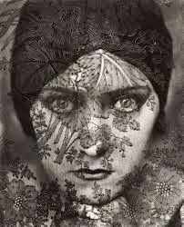
1. Edward Steichen's photos caught my eye because I noticed that most of his famous pictures were portraits.

2. I see the details on the piece of lace covering the lady's face. I see the big bold eyes on the model. I see the black round hat on the lady's head. 
    I smell the make up that was applied on the model's face. I smell the old clothes that were on the model. I smell the piece of lace cloth on the models face. 
   I hear the nervousness of people working on the model to make sure she is ready on time. I hear the hangers of clothes being pushed to one side then the other as the stylist picks out what the model will wear. I hear the camera and the noises it makes as I adjust it. 
   I taste the strong coffee everybody is drinking to wake up. I taste the strong perfume that was sprayed on the model's skin. I taste the hairspray that is on the model's hair. 
   I feel the tension in the air. I feel the seriousness expressed on the model's face. I feel the lace covering the model's face. 
   I see the wooden cane that the man is holding onto. I see the background behind the man. I see the man and the way he is standing. 
   I smell the wood that was used in this picture. I smell the strong cologne that has been sprayed on the man. I smell the dusty furniture that was in this picture. 
   I hear the man yelling orders at people. I hear the stuttering of the people as they approach the man. I hear the squeaking of the floor when people take a step. I hear the wooden cane hitting the floor. I hear the shuffling of people coming to and from the man fixing his clothes. 
   I taste the strong coffee that the man has drank. I taste the the gel that was used to slick back the man's fair hair. I taste the light make up that was applied to the mans face for the photo shoot. 
   I feel the anger that the man has i his voice. I feel the smoothness of the then wood in the background. I feel the soft black jacket the man is wearing. 

3. I would like to do a power point. 


Photo Mural Project

1. I think a cool theme for mural would be all of the "dress up" days that we have had so far such as Pink out and Black out. 

2. I think we should use both phone cameras and normal camera. I think we should use both types of cameras so we can see the different types of pictures people took.

3. We should put this mural in front of the library so everyone that walks buy can see it. 

Friday, October 3, 2014

Academic Shoot and Reflection

Simplicity

1.) I think I followed the simplicity rule pretty well. The background was pretty plain and that made the subject stand out. I do think that I could have done better. 
2.) The subject in this picture is the boy sitting down and reading a book.
3.) I think it is clear to see who the subject is in this picture. 
4.) I could have take this picture from a different angle that would make the subject stand out even more.

Lines
1.) I think I followed the line rule. 
2.) The subject of this picture is the colorful drawing by a student. 
3.) I think the subject stands out and is clear to see because it is very colorful.
4.) I could have taken this picture from a closer angle so the subject can stand out more. 

Rule of Thirds
1.) I don't not think I followed this rule very well. 
2.) The subject of the picture is the students at the table.
3.) I don't think it is clear what the subject is because there is a lot in the background. 
4.) To improve this picture I could have taken the picture closer up. 

Balance
1.) I don't think I followed the balance rule.
2.) The subject in the picture are the students.
3.) It is not clear what the subject is.
4.) I could have taken the picture of just one student instead of multiple. 
Framing
1.) I think this picture of framing is okay.
2.) The subject of this picture is the art work the student is working on.
3.) I think it is not very clear what the subject is because there is other things in the picture that stand out.
4.) I could have taken the picture from behind the student so you could see the art from the students perspective. 


Thursday, September 25, 2014

Academic Shoot Preview Assignment

The Story
I think this photo tells the best story because the students have joined together in a circle to pray. This looks very calming and the students are being respectful and they are being recognized for their beliefs and religion.


Action and Emotion
This picture shows a lot of action and emotion. The two girls are doing an experiment probably in their science class and they look very happy and amused because of all the bubbles floating in the air around them.


Filling the Frame
This picture is very interesting because of the way the students and the teacher are interacting. You wont see this happening in most schools and classrooms. I think this picture is very unique and funny. 


Part 2
My favorite picture was the "Junior Year" photo. This picture was black and white and looked like a fish eye effect. The picture was taken from a birds eye view and you can see the student sitting and reading.

1. I liked this picture because it was black and white. Another thing I liked about this picture was that it looked like it was taken with some sort of fish eye camera or lens. 

2. One Rule of Composition shin in this picture was simplicity. Since the photo was black and white the background was very plain. 

Part 3
1. I think I could take a picture similar to this in a library or classrooms with fun teachers. 
2. I would like to to pictures in the library and in biology class rooms when they are doing labs. 
3. I will follow the rules of composition and I will take pictures of people interacting with others. 


Tuesday, September 23, 2014

Great Black and White Photos Part 2


Edward Steichen
Edward Steichen was a very famous photographer. He was born on March 27, 1879 in born Bivange, Luxembourg and died on March 25, 1973.   He attended Academie Julian and studied painting. Some of his jobs included being a director. He also worked for Vanity Fair and Vogue were he took pictures of celebrities and fashion. Aside from being a photographer he published books and he painted. He was most known for taking portraits of famous people in that time. One of his most famous portraits he took were the portraits of  Winston Churchill and Audrey Hepburn.